
And now for the most exaggerated, overblown, annoying, and ignorant claim in the financial media today: “The stock market is dramatically overvalued and headed for a fall.”
The financial media from the Wall Street Journal to CNBC and everyone in between would have us believe that the S&P 500 is dangerously overpriced. Stocks are currently trading at a P/E ratio of nearly 19, which is 15% higher than the long-term “average” P/E ratio of 16.5.[Cue the financial media freakout]
C’mon man (woman). You don’t know what you’re talking about. Using the average P/E to determine whether or not the market is fairly priced is like using a thermometer to determine how fast the wind is blowing. A thermometer is a useful device for measuring body temperature, but useless for measuring wind speed. As we will soon show, using the average P/E alone to value the market is also useless.
The chart below alone is enough to prove that average P/Es don’t tell you a thing. The blue line shows the actual P/E ratio vs. the long-term average P/E shown by the orange line.
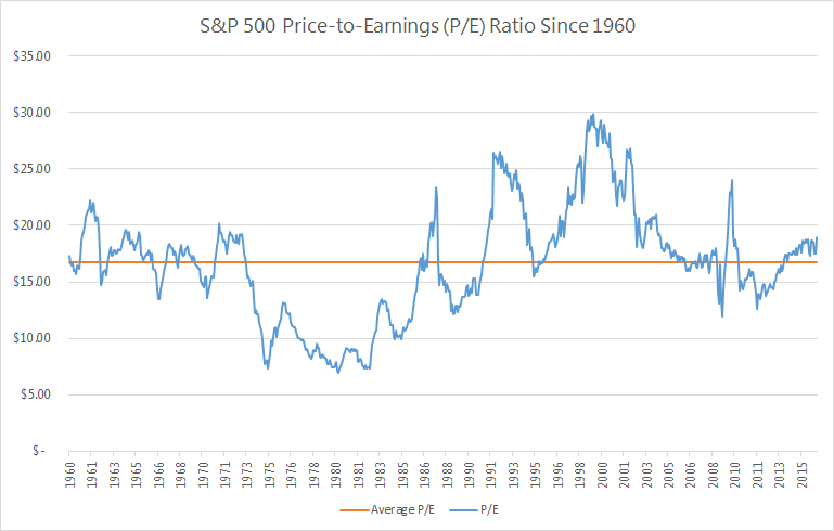
Can any useful information be derived from this chart? Does the orange line tell you anything about the blue line?
There are; however, a few things we can glean from the chart.
1. Stocks Almost Never Trade at “Average P/E” Levels
With the frequency that “average P/E” is thrown out at us, you would think stocks often trade at the average P/E. But they don’t. In fact, stocks have traded at or near their long-term average in just 9 out of 676 months going back to 1960. That’s 1.3% of the time. The other 98.7% of the time, stocks did not trade at their long-term average P/E.
Can we just get the message through to the financial media: stocks almost never trade at their average P/Es. In effect, there is no such thing as a “normal” P/E. Please stop referencing it. It doesn’t exist.
2. Today’s P/E Ratio Isn’t Particularly High
Look at the far right of the chart showing where P/Es stand today vs. the historical average. Does it look all that high to you? It’s not.
The S&P 500 has traded at a P/E of 19 or higher nearly 30% of the time. Are P/E ratios higher than they have historically been? Yes. But it’s not like 19 is uncharted territory. It is still well within what we have seen before.
3. Stocks Can Still Go Up from “Elevated” P/Es
3. Stocks Can Still Go Up from “Elevated” P/Es
Even when the media are proclaiming that P/Es are “elevated” compared to historical averages, stocks have produced good results. Since 1960, when stocks have traded at a P/E of 19 or more, they have produced positive price returns more than 66% of the time over the next 12 months.
Do P/E Ratios Make Any Sense?
Historical P/Es look completely random, don’t they? Why did stocks trade at 7 times earnings in 1980 and then 30+ times earnings in 1999? Let’s see if we can find anything that would suggest why P/Es traded where they did over the last 50 odd years. If we can, we would have an honest to goodness valuation tool.
What is the “Right” P/E?
We’ve seen that stocks almost never trade at their average P/E. So that’s obviously not the “right” P/E. But if not the average, then what? To determine that, we need to flip our thinking upside down. We’re going to look at what is called the “earnings yield,” which is simply the P/E ratio flipped into an E/P ratio. If you buy a stock for $100 that generates $8 per year in earnings, you have paid 12.5 times earnings (P/E = 12.5). Flip that upside down and you would see that your “earnings yield” is $8 divided by $100 = 8%.
The “earnings yield” is more useful when comparing stocks (and businesses) to alternative investments that are quoted in percentages. When earnings yields on stocks are higher than bond yields - stocks are a better bargain. When bonds are yielding more than stocks - you might be in favor of buying bonds, instead.
Our research shows there is a high correlation between earnings yield (P/E upside down) and inflation. The chart below shows earnings yield as the blue line and inflation as the orange line.
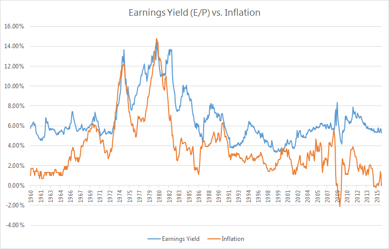
There is a clear relationship between earnings yield and inflation. When inflation goes up, the earnings yield also increases (meaning the P/E ratio goes down). The statistical correlation between the two data series is more than 70%.
In the 1970s and 1980s, inflation was higher than we’ve ever seen it. At one point, inflation reached nearly 15%. At that time, the earnings yield for stocks reached nearly 15%. If you flip a 15% earnings yield back into P/Es - we calculate 1 / 15% = 6.7. So high inflation means high earnings yield (low P/E ratio).
The reverse is also true. When inflation is low, earnings yields should also be low (P/E ratios high). And that is what we have seen. In periods where inflation has been less than 3%, earnings yields have averaged approximately 5.2%. Flipped upside down, that means the P/E in those low inflation periods was 1 / 5.2% = 19.
So that brings us to one last chart. This shows the “real” earnings yield for stocks, which is simply the earnings yield (E/P) minus inflation. According to our research, this metric is a much better indicator than the simple P/E for determining the relative value of stocks at any given point in time.
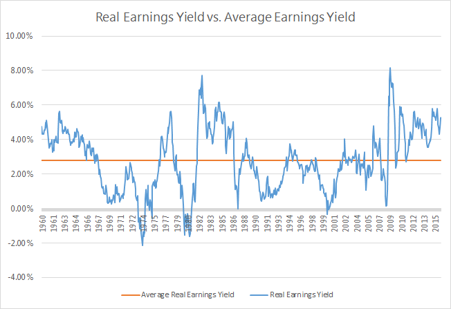
When the real earnings yield (blue line) has been below the long-term average (orange line), that has meant that stocks were overpriced relative to the then current inflation levels. When the real earnings yield have been higher than the orange line, stocks have been a good buy.
You can see that this model correctly predicted that stocks were way overvalued in the mid-1970s, early 1980s, in 1987, during the “tech bubble” in the early 2000s, and during the Great Recession of 2008.
It also correctly indicated that stocks were a great value in the early 1980s and again in 2009.
So… Are Stocks Overpriced Today?
Today’s real earnings yield spread is 4.4%, which is significantly higher than its long-term average. If the earnings yield were to trade at it historical relationship to inflation, the appropriate real earnings yield today would be 2.8%. When you add back current inflation of 1%, we see that the appropriate earnings yield for the S&P 500 is about 3.8%. When you flip that upside down into P/Es, we get 1 / 3.8% = 26.3.
Are we suggesting that P/E ratios should go to 26.3? Not necessarily. But we are saying that the current low-inflationary environment should result in stocks trading at higher P/E ratios than the “average P/E.” If we were to see inflation remain at 1% for the next decade, it is entirely possible (and reasonable) that stocks could head towards a P/E of 25+. The CNBC broadcasters are starting to sweat at the thought of it.
For those of you that are still skeptical that stocks can go higher from here, just think about this. The current real earnings yield for the S&P 500 is 4.4%. There have been 123 months since 1960 when stocks have traded for a higher yield than that. With those months as a starting point, the average return over the next year was 21.5%.
So can P/E ratios expand from here? History tells us overwhelmingly that they can. Not only that, but the current inflationary environment says that they should.
Conclusion
Are we saying stocks are going to go up 21.5% over the next 12 months? Maybe yes, maybe no. There is reason to believe that the current slow economic growth will likely reduce future earnings growth and, thus, impact future stock returns. However, it should be clear that stocks are not trading at significant premiums to where they should be. Unless earnings collapse or inflation explodes, stocks could (and probably will) continue to move higher on the back of rising P/Es.
So next time you’re out with your friends or watching some talking head on CNBC and the topic of P/E ratios being high – remember that average P/Es are meaningless as a valuation tool. Anyone who says they should trade at 16.5x just because that has been the average doesn’t know what they are talking about. There is no such thing as a normal P/E.